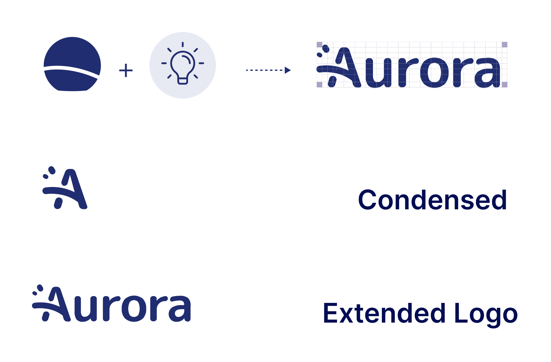
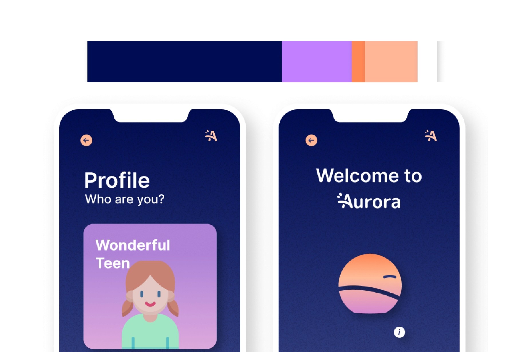
Aurora
Digital wellbeing of children
Overview
Both children and their parents struggle to set boundaries when it comes to digital wellbeing, mainly because of lack of education on the topic itself and because of technological advancements. Aurora is a routine night light that empowers kids to be aware of digital wellbeing, whilst bridging the relation between parents and kids through combined awareness on the topic.
Challenge
How might we design for behaviour change of children making them conscious of their use of technology and help them create a balanced use?
Role
Researching, digital ethnography, ux research and relevant tools for analysis , conceptualisation, service design
Tools
Figma
Project Collaborators
7 group members
Year
2021
Methodology
The process focused on both the first diamond of UX “Discover and Define” and second diamond "Develop". Research insights according to the protocol shown below directed developing the solution during second phase.
Scroll ←


Desk Research
Technological independence is reached at an earlier age every year. Currently, 65% of children have their own phone by age 12.

62% of children have had a negative experience online. Only 24% of children recognise technology as harmful. Between them they report these concerns:


A correct use of technology can help
them to fulfill their needs:
Who am I?
Stage of identity and role confusion. They look for a social relationship.

52% of children reported that social media improved their friendships.
30% feel more confident and outgoing thanks to social media.

71% of parents belive that technology is more harmful than beneficial for children.
Moreover, they see tech as an obstacle for friendship and education.
Benchmarking

Self-contained
Such apps more fun than intrusive ones
Positive Reinforcement
Through time off device detection
Enagaging
Lack of reward for screen-off time
Intrinsic motivation
Gamification can be used to trigger
Positioning

Digital Ethnography
At this phase two main questions were shortlisted for further investigation: family values and technology, parents concerns regarding device usage. Using data scrapped from Facebook and Reddit we were able to get further insights for the design concept.


Frequent concerns
Social media, privacy, sleep issues
Negative
Taking frustration makes it worse
Positive
Safety and health are positive factors
Neutral
Change, regularity and possibility are neutral

Concept
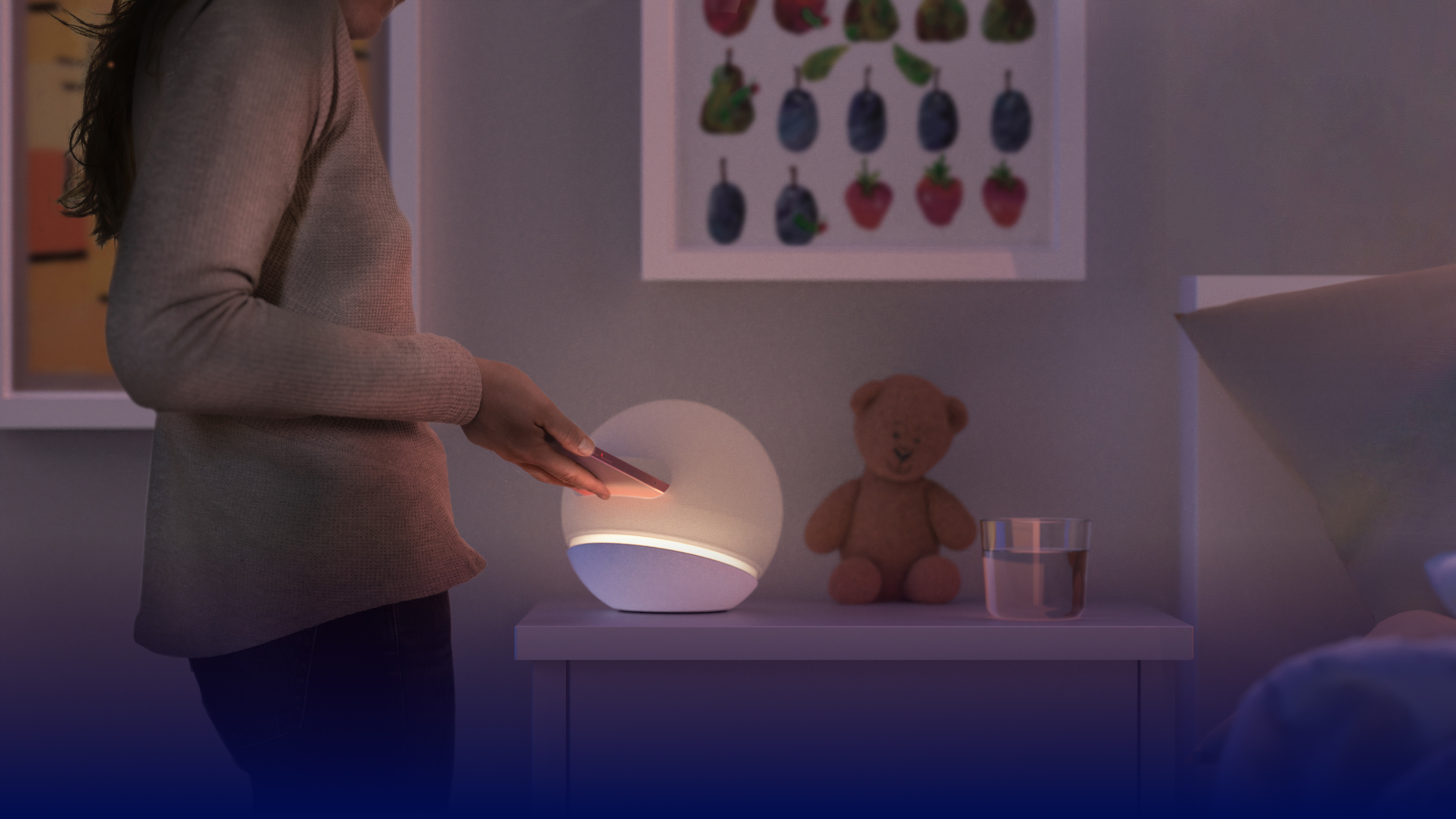
This night light is an individual totem with personal meaning to its user. Situated in the bedroom, it gently nudges pre-teens into making the right choices related to nighttime tech use.

User Storyboard


UX Journey
For UJMs and CJMs we divided our user into 2 categories and our customer into 2 categories and then developed one combined journey for the categories, this was done to address maximum user types.
User Journey Map

Customer Journey Map

MMD
Mental Model Diagrams developed to interlink hiccups from both users (parents and kids) and highlight significant design hints from these.

Service Design
Developing in depth the backend of our product line and how it would work from production to execution to later customer services. We developed in depth blueprints for the service as well apart from the summarised Service Diagram below.


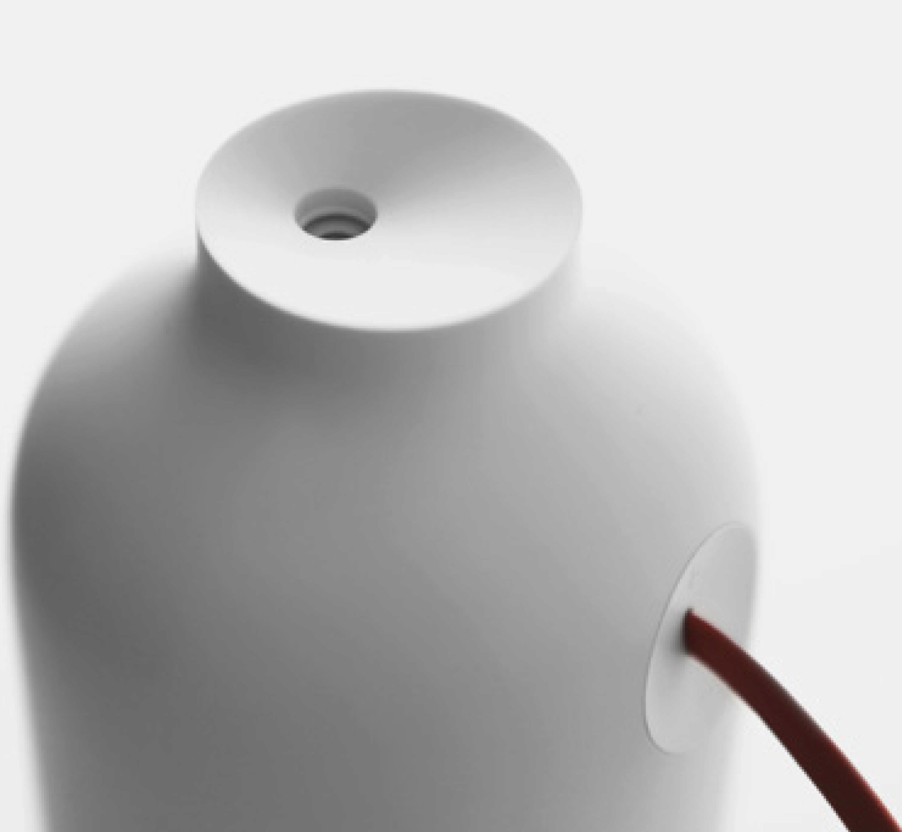


Vase
Taller, organic shape, for vertical phone insertion. The relatively wide diameter made the phone rattle against the tall walls of the cylinder making it feel like a toy. Not User friendly.
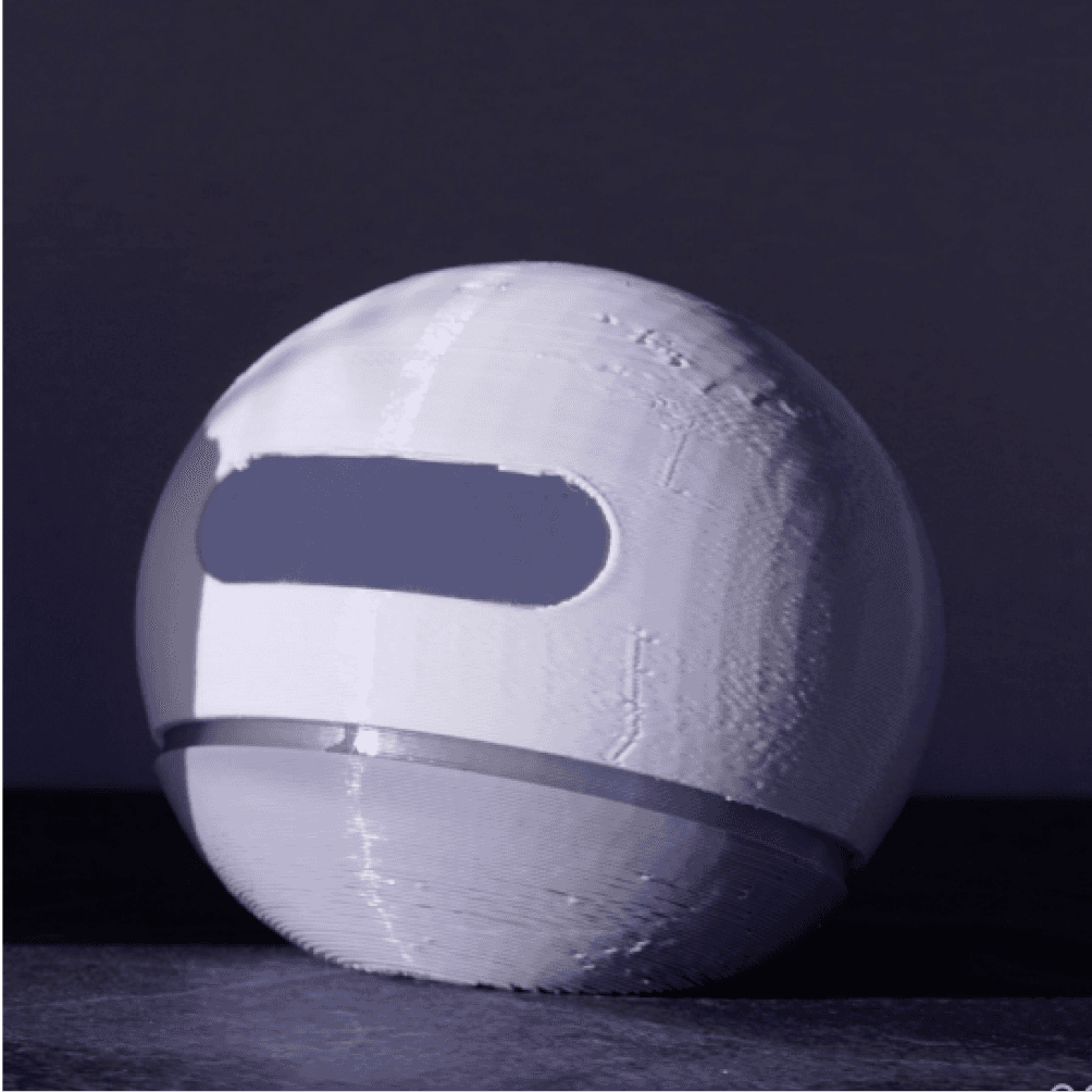
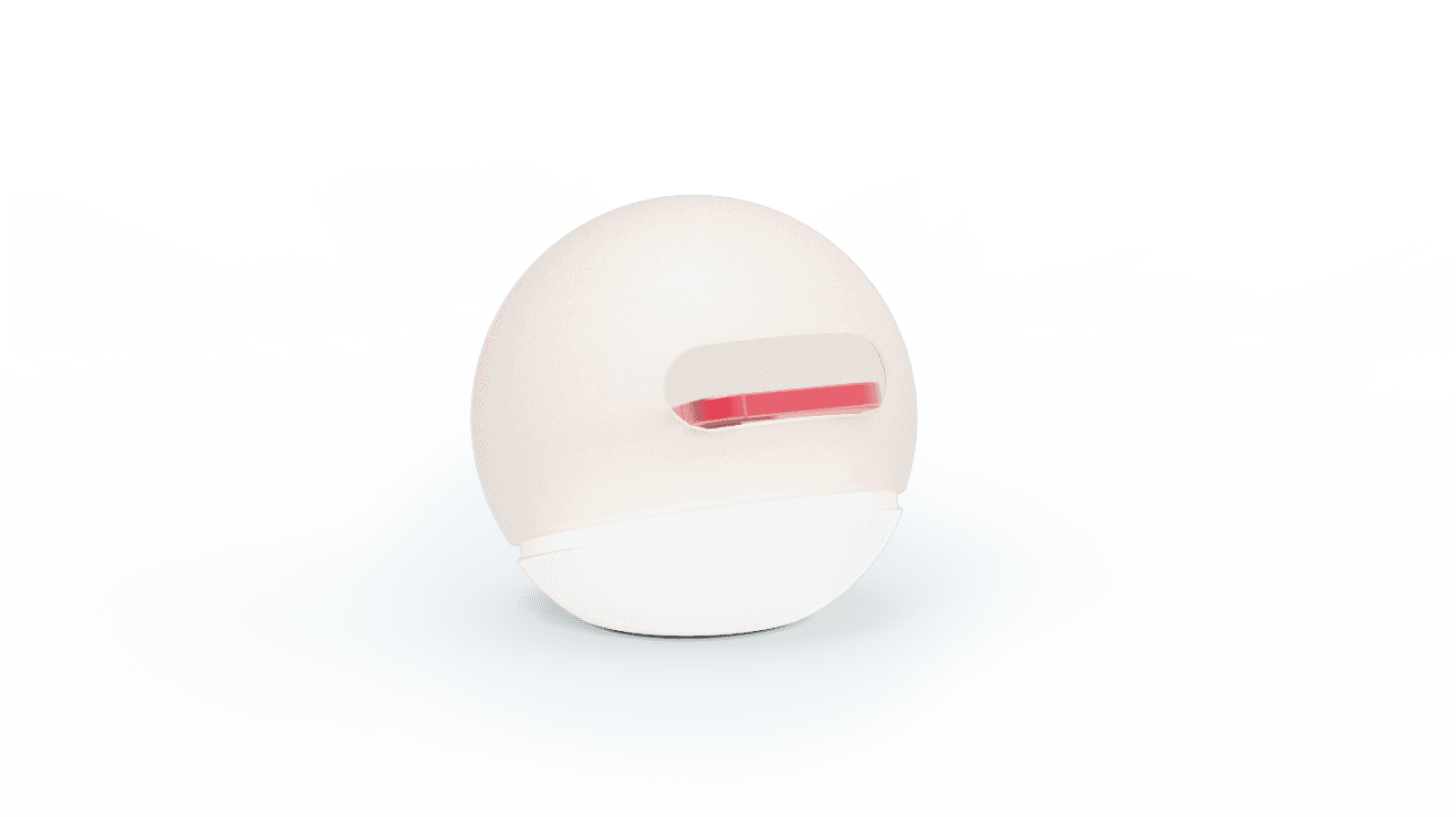
Sphere
Compact shape with slanted bed for the kid’s phone. The phone protrudes from the opening by a little, which keeps the product nice and small. Compact, gives feeling of a buddy for kids, positive experience.
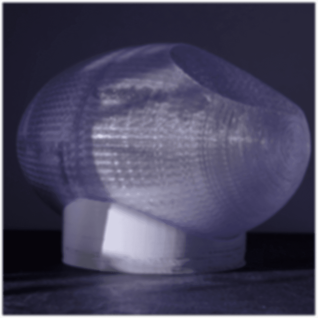
Basket
Wide nest with a round base for horizontal phone placement. The flat bed for the phone is promising, but the ellipsoid is large with vast empty space making your phone feel like an alien or sitting in bed feeling. Unpleasant user experience.
View other works

Let's work together!